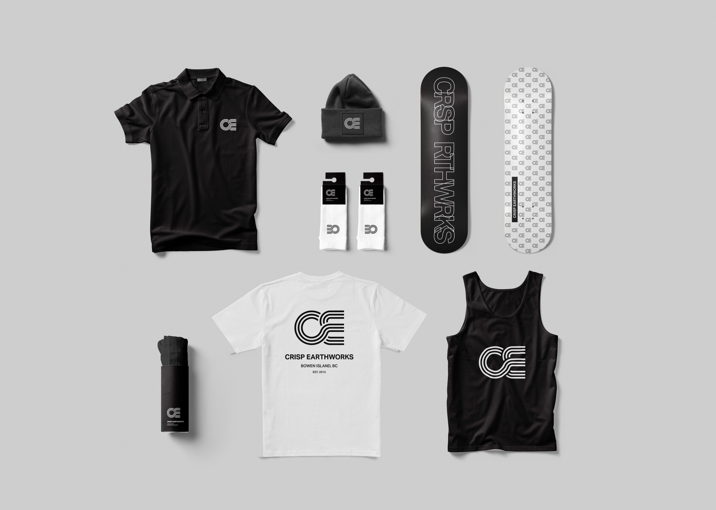
Crisp Earthworks

Founded on Bowen Island, Crisp Earthworks emerged as a cornerstone in excavation services.

The company experienced growth in recent years and expanded throughout the Sea to Sky corridor and needed a more modern and professional brand identity to communicate that.

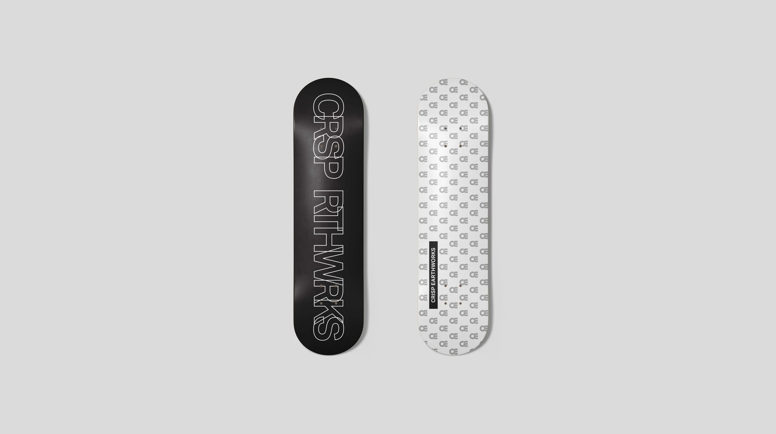
The founder, a skateboarder at heart, wanted a logo that worked as well on heavy machinery as it did on apparel like toques and hoodies.

Crisp Earthworks entrusted us to build a new foundation for their brand—a task we did not take lightly.

Brand Identity | Graphic Design | Product and Packaging

Image of Crisp Earthworks excavator wrapped in black and logo
Image of black t-shirt with Crisp Earthworks logo in white on the back, draped over a railing
Image of a variety of merchandise for Crisp Earthworks. T-shirts, skateboards, socks, toques, tank tops, all in black and white
Image of a black hard hat with the Crisp Earthworks logo on the front
Image of a fern in black and white
Image of man holding skateboard in front of face with no wheels showing Crisp Earthworks logo. All in black and white
Image of a Crisp Earthworks branded gate
Image of Crisp Earthworks logo
Image of a branded Crisp Earthworks skateboard front and back
Image of a hoodie showcasing the front and back with branded logos of Crisp Earthworks
Image of Crisp Earthworks branded equipment
Image of a Crisp Earthworks Sprinter van wrapped in black and with logos on the back window
Image of a mountain range in black and white
Image of a branded Crisp Earthworks skateboard front and back
Image of the Sea to Sky corridor in black and white with the Crisp Earthworks logo
Image of a shipping container wrapped in black with crisp earthworks logo on side
Previous
Previous

Arc'teryx

Next
Next

Mustang Survival Corp.